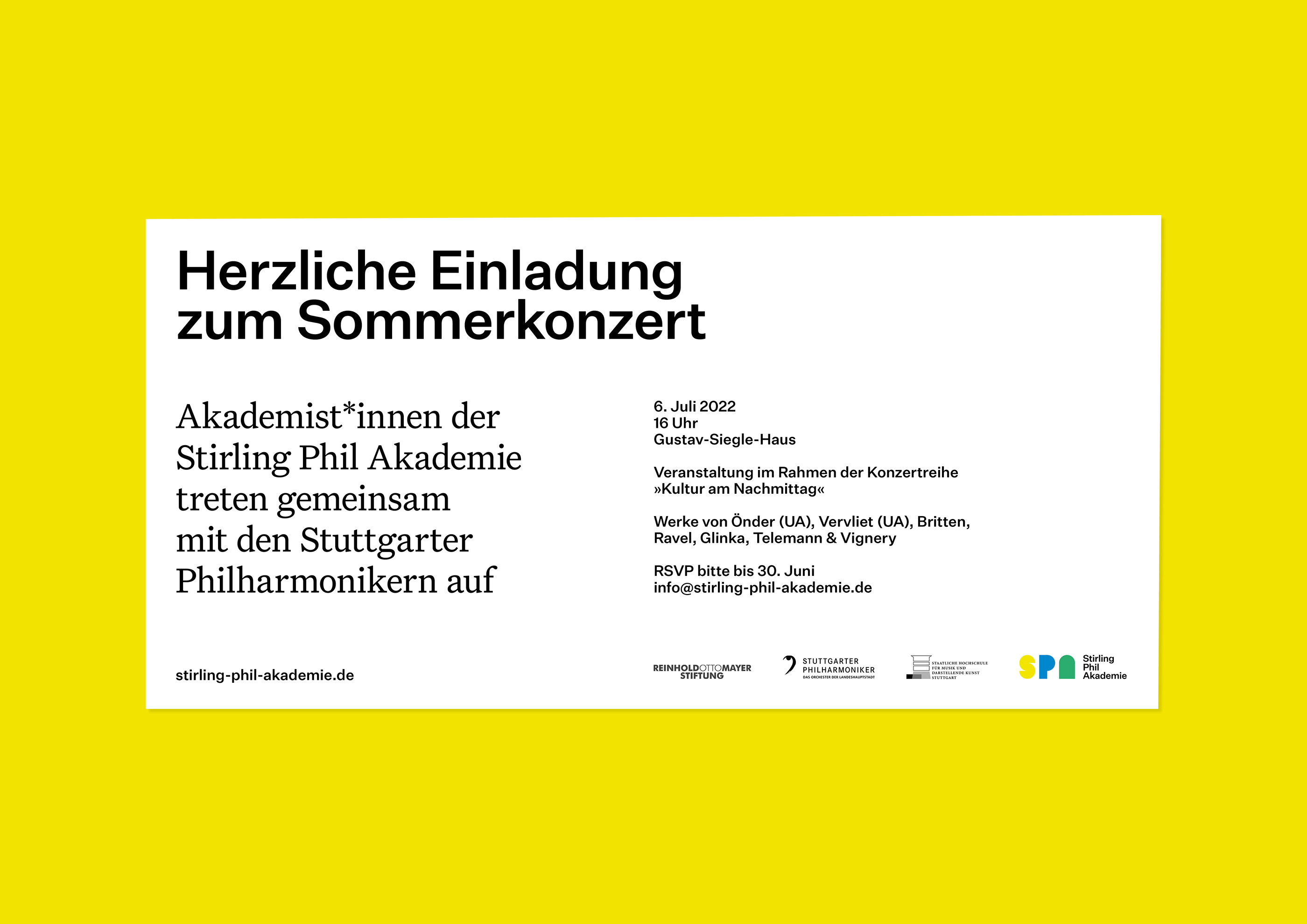
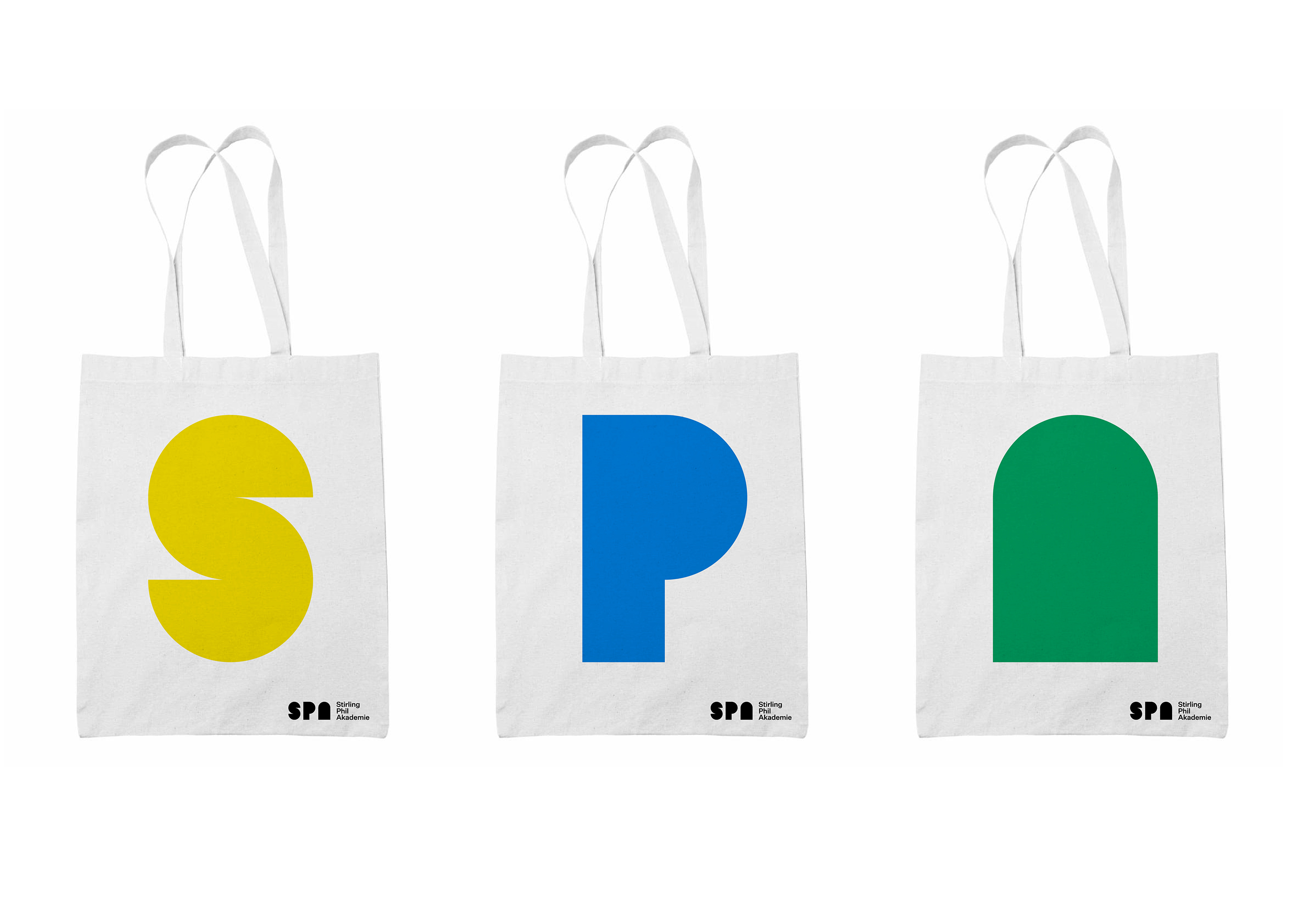
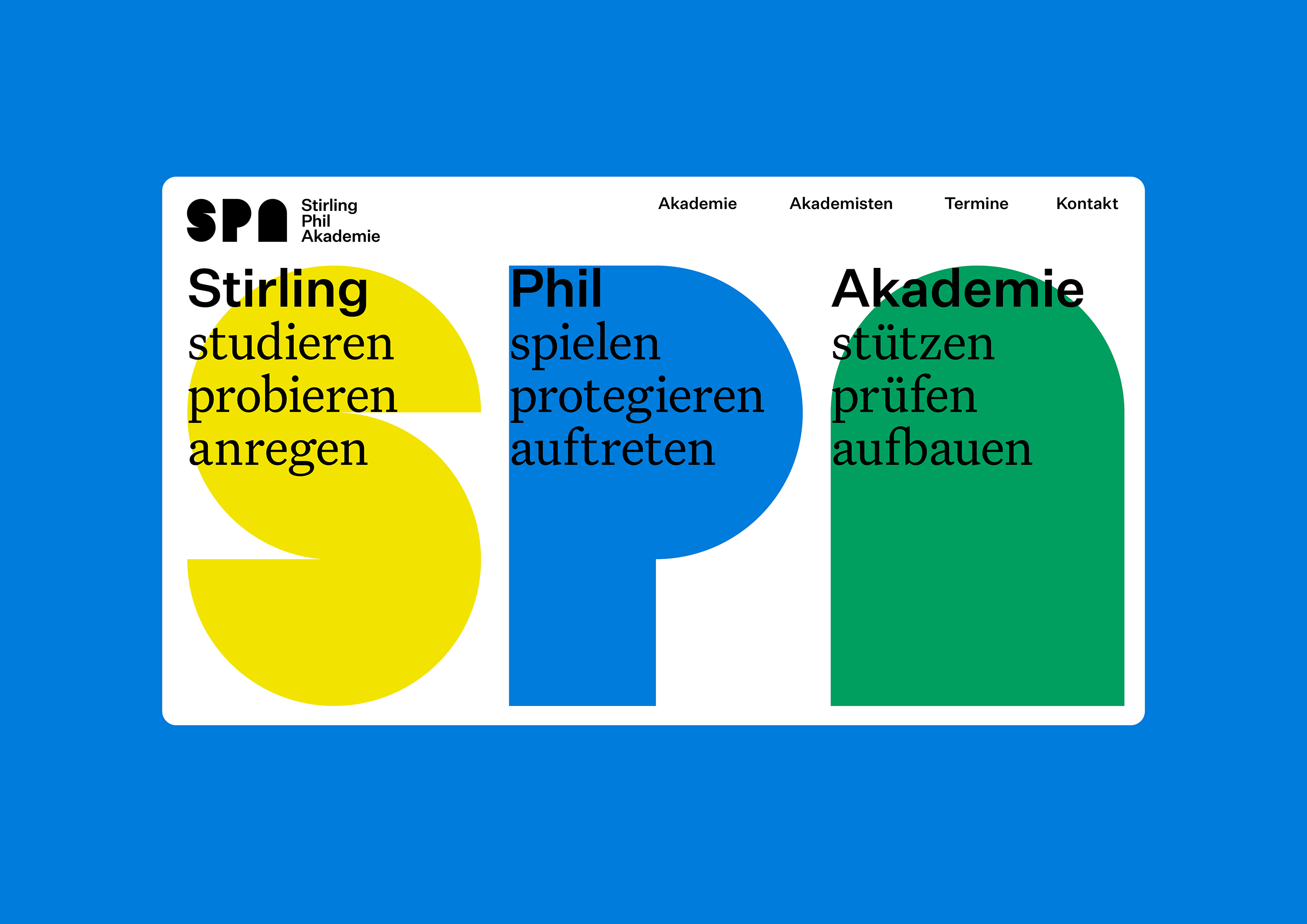
Two of Stuttgart’s most important musical institutions are jointly creating an authority for the future: In order to promote young orchestral talent, the State University of Music and the Performing Arts and the Stuttgart Philharmonic Orchestra have founded the Stirling Phil Academy – supported by the Reinhold Otto Mayer Foundation.
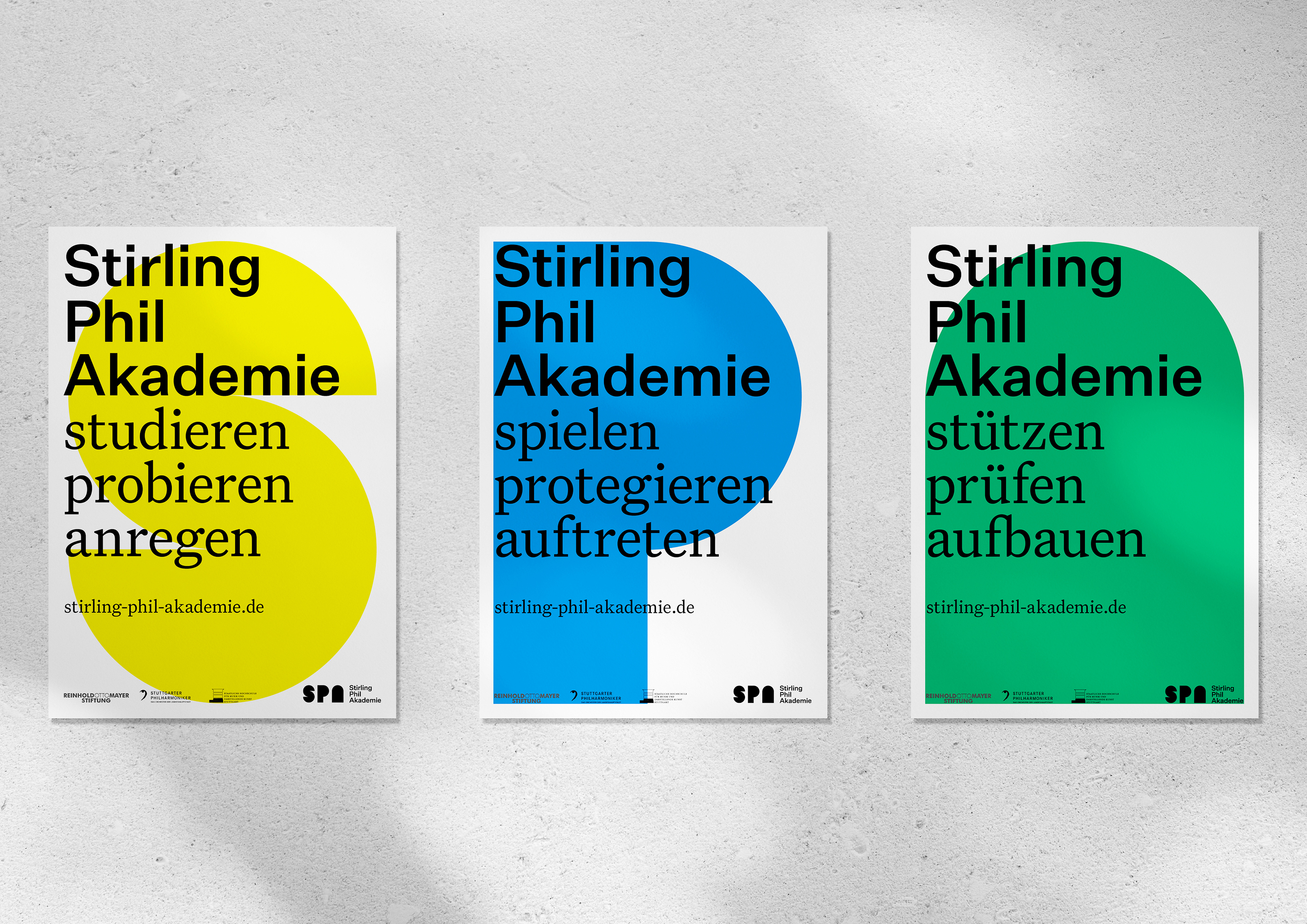
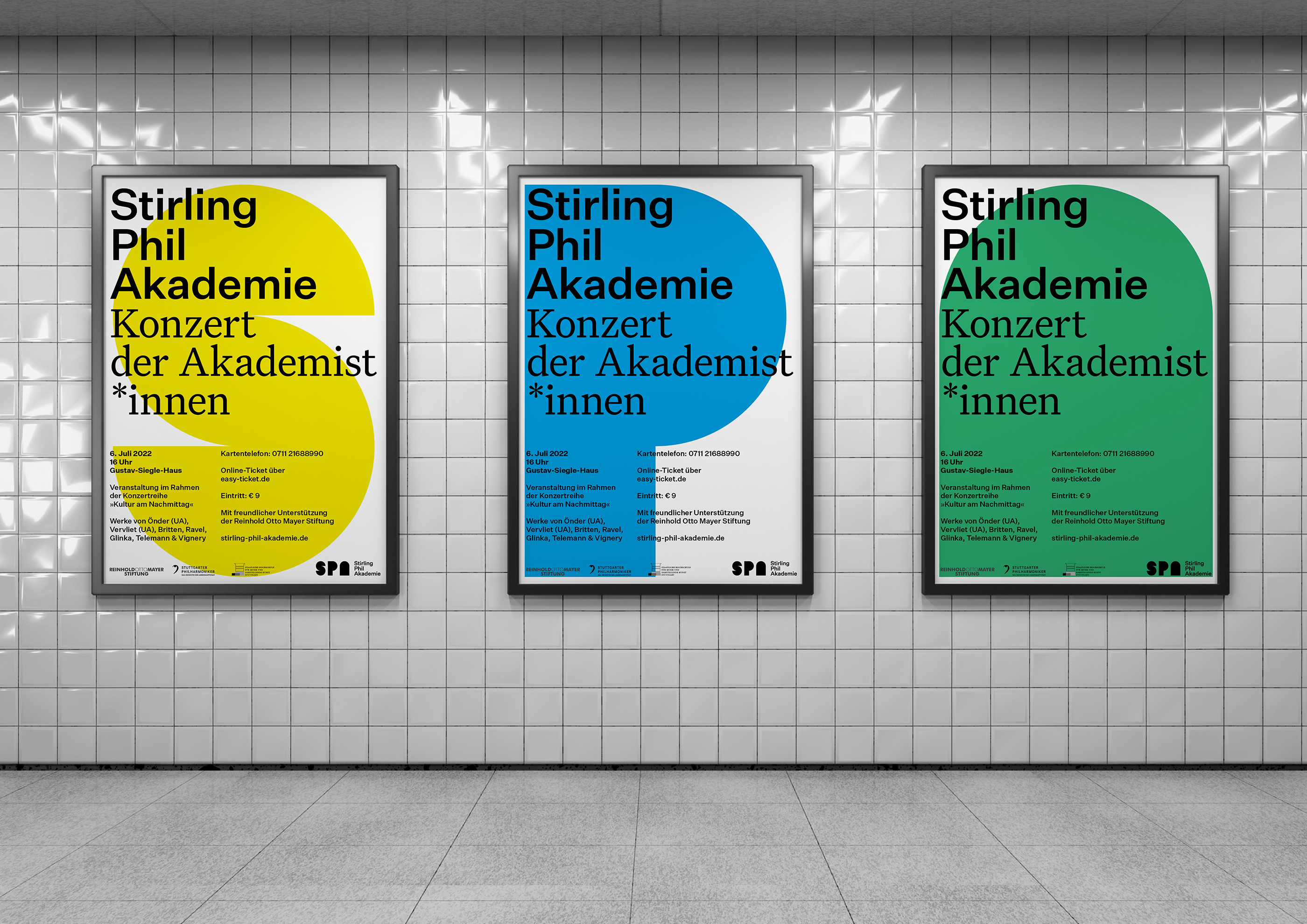
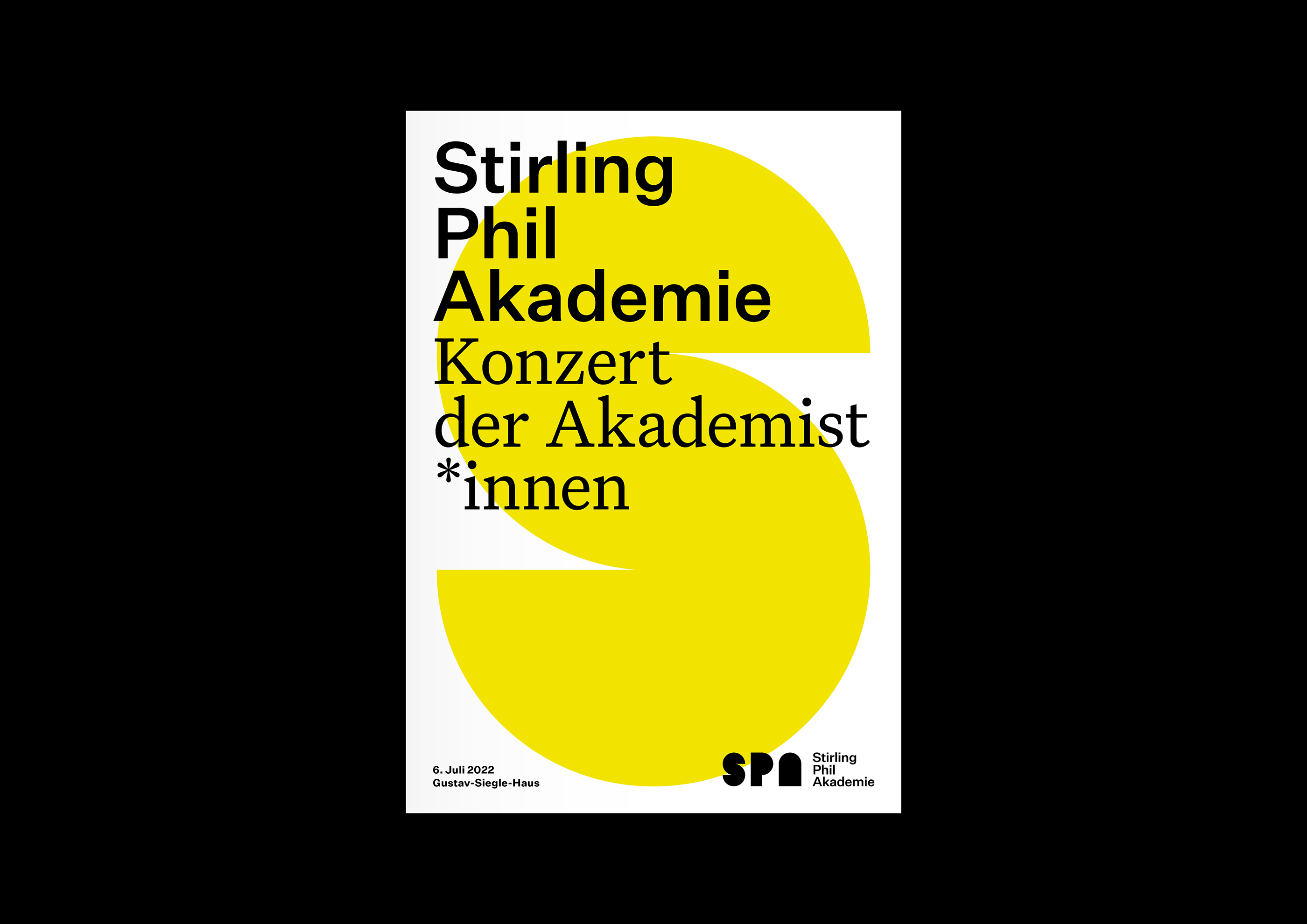
The design concept for the new academy is based on a graphic language that integrates all participants and yet represents something unique and new. The basic element is the circular shape, which can be found in each of the three partners’ design details. Out of this shape three letters emerge, forming the academy’s signet and having a strong impact both individually and as a triad. Instead of one, two fonts were chosen, each interpreting the corporate identity of one of the partner institutions – sometimes with, sometimes without serifs. The color concept also combines the existing with the new. It relies on the yellow of the university building, the blue of the Philharmonic Orchestra and the color resulting from this combination: green. In its extension, the color concept plays with the connections between sound and color determined by frequency. As a result, colors can be assigned to certain keys – for example, on concert posters.